Born & Raised™
Built For Loud Nights
CLIENT
Born & Raised (Concept)
Born & Raised (Concept)
INDUSTRY
Live Music Event
Live Music Event
DELIVERABLES
Brand identity
Print Design
Social Media
Brand identity
Print Design
Social Media
ROLE
Art Direction
Design
Art Direction
Design
Overview
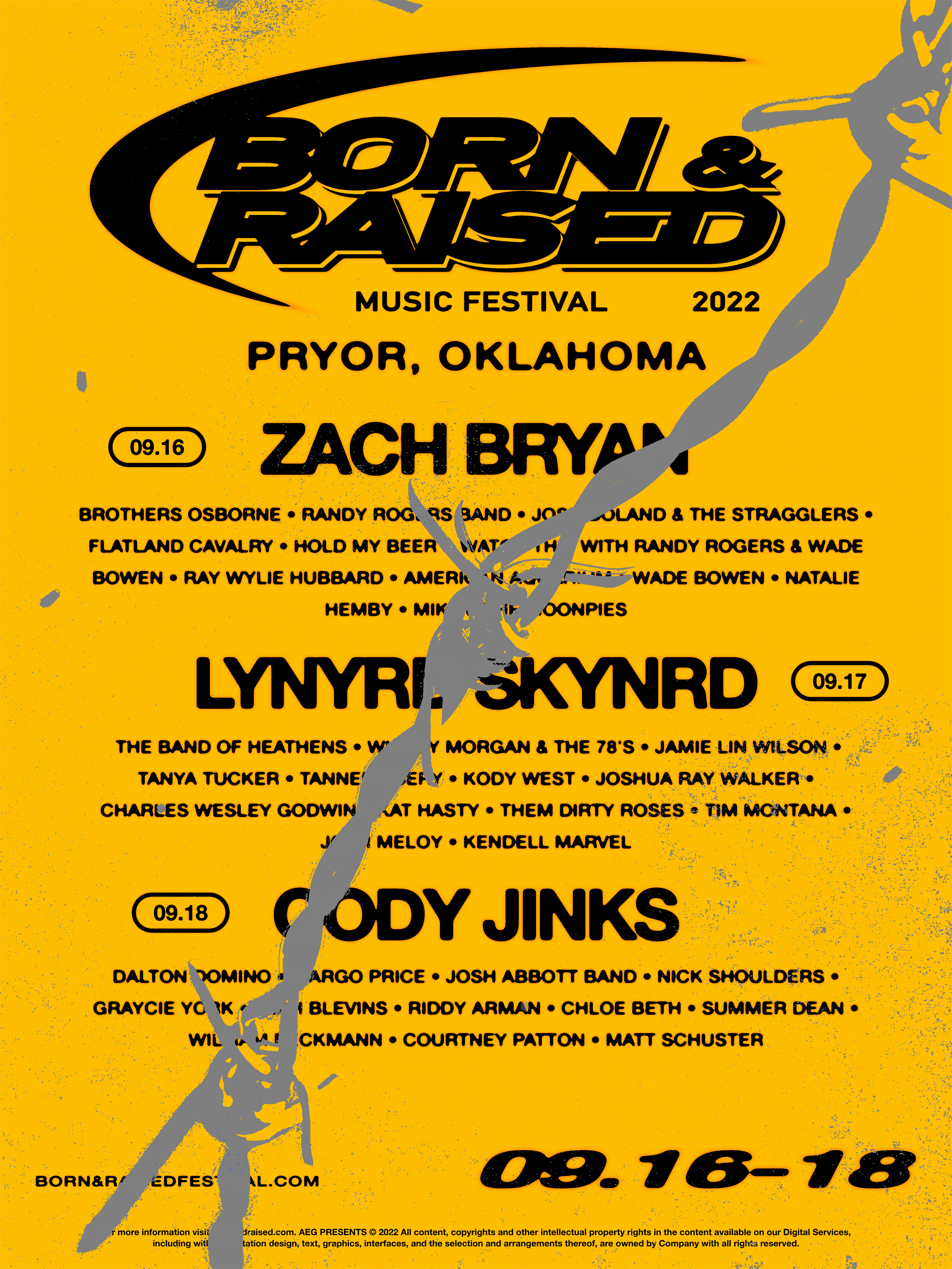
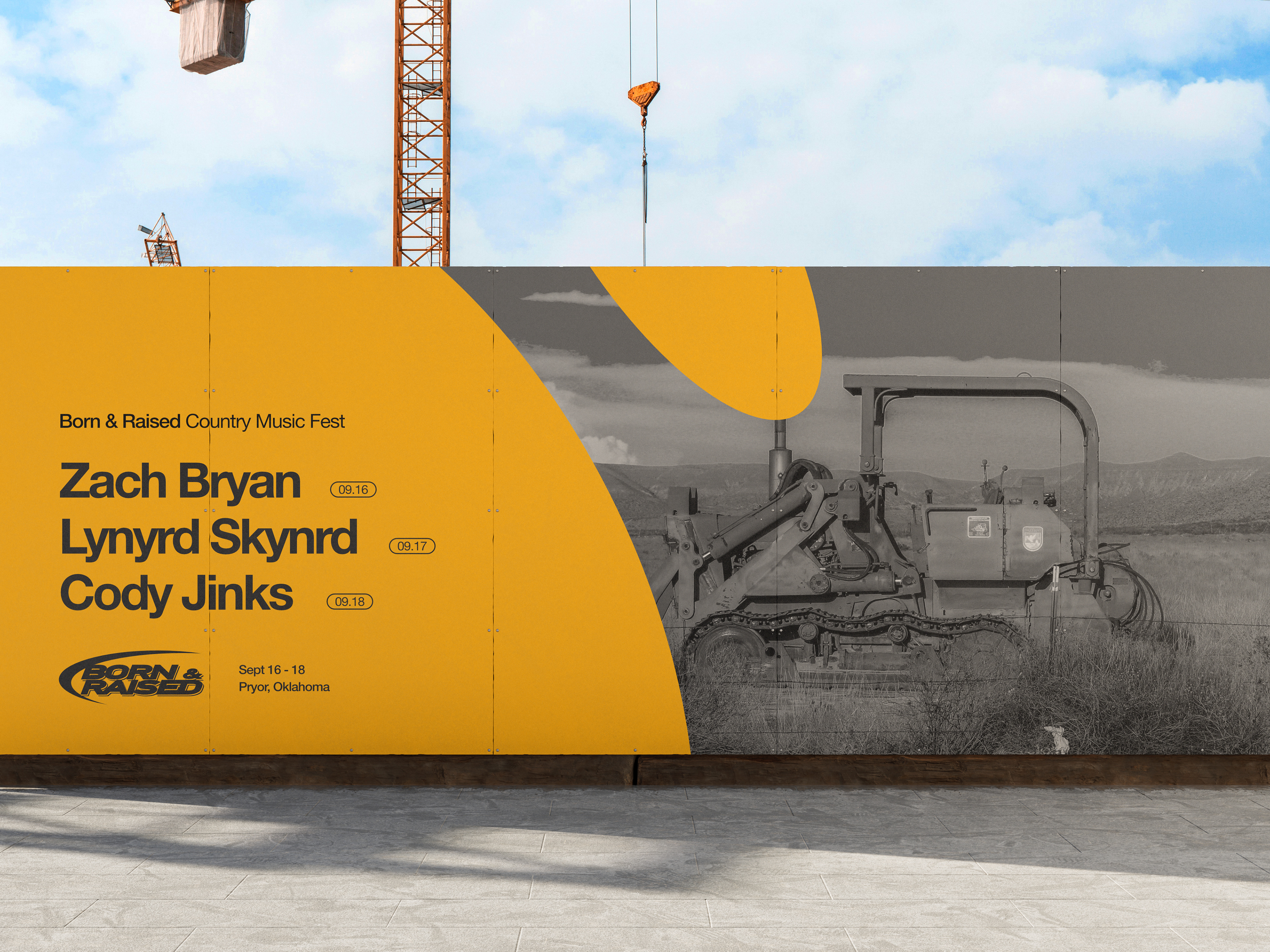
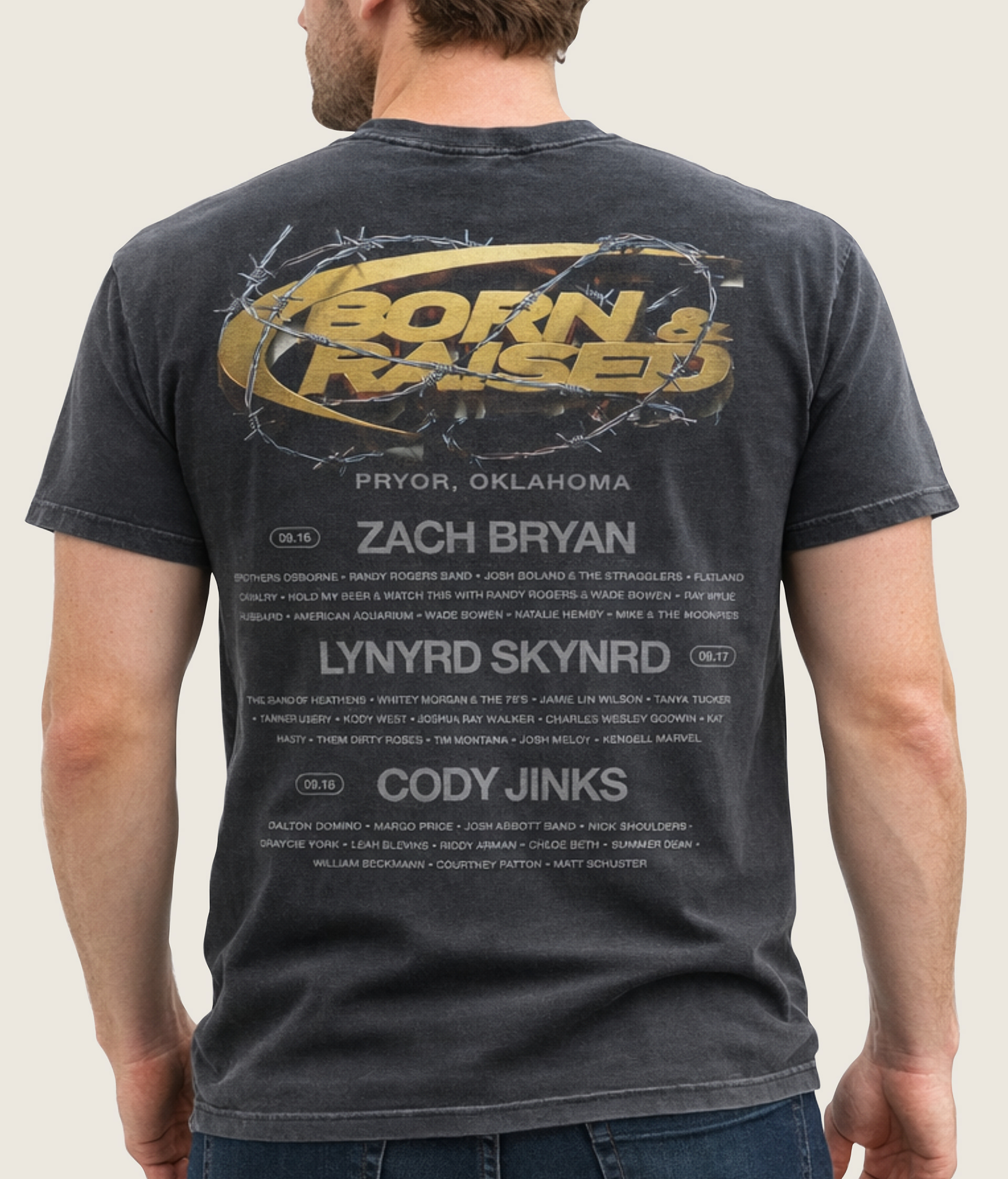
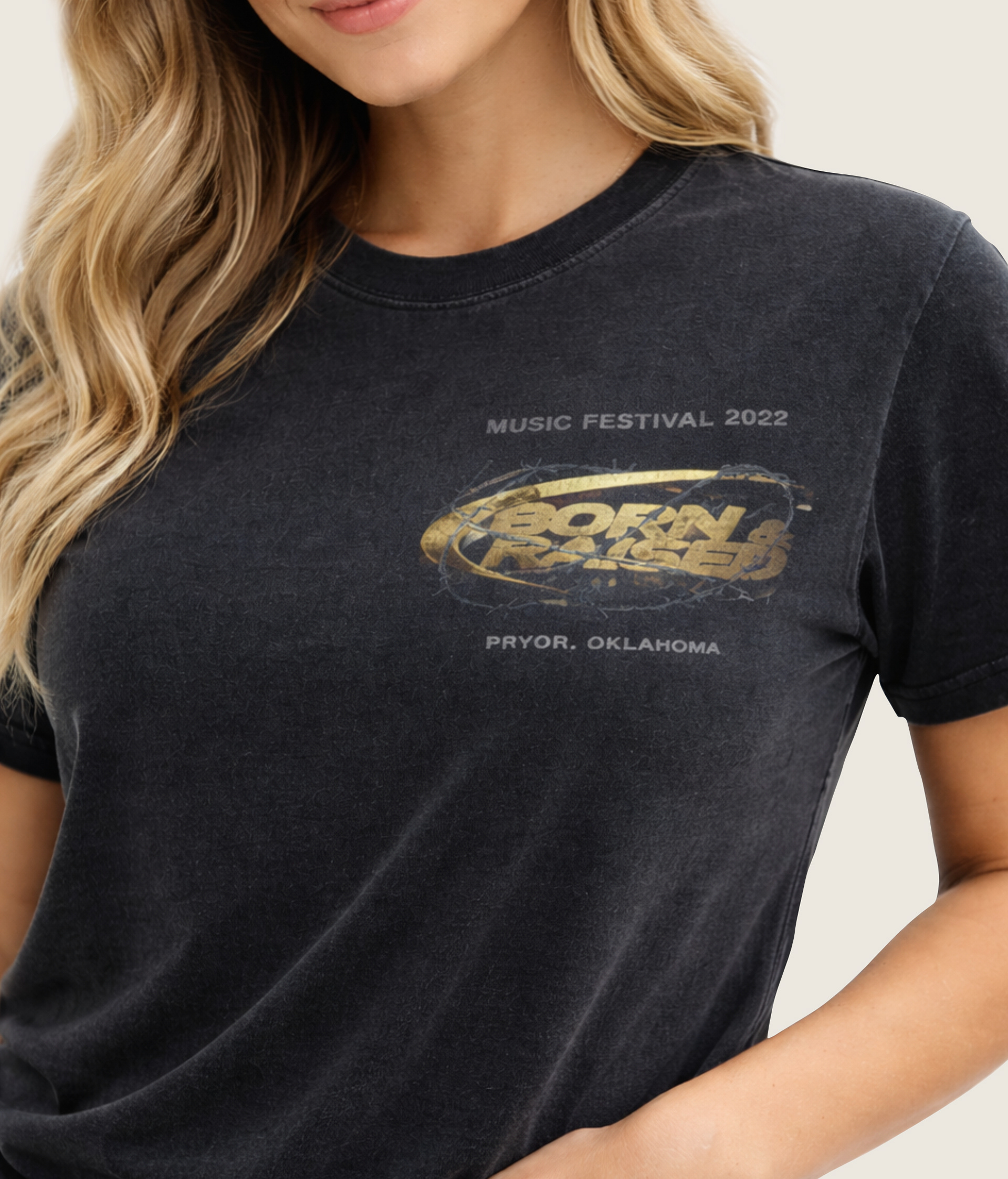
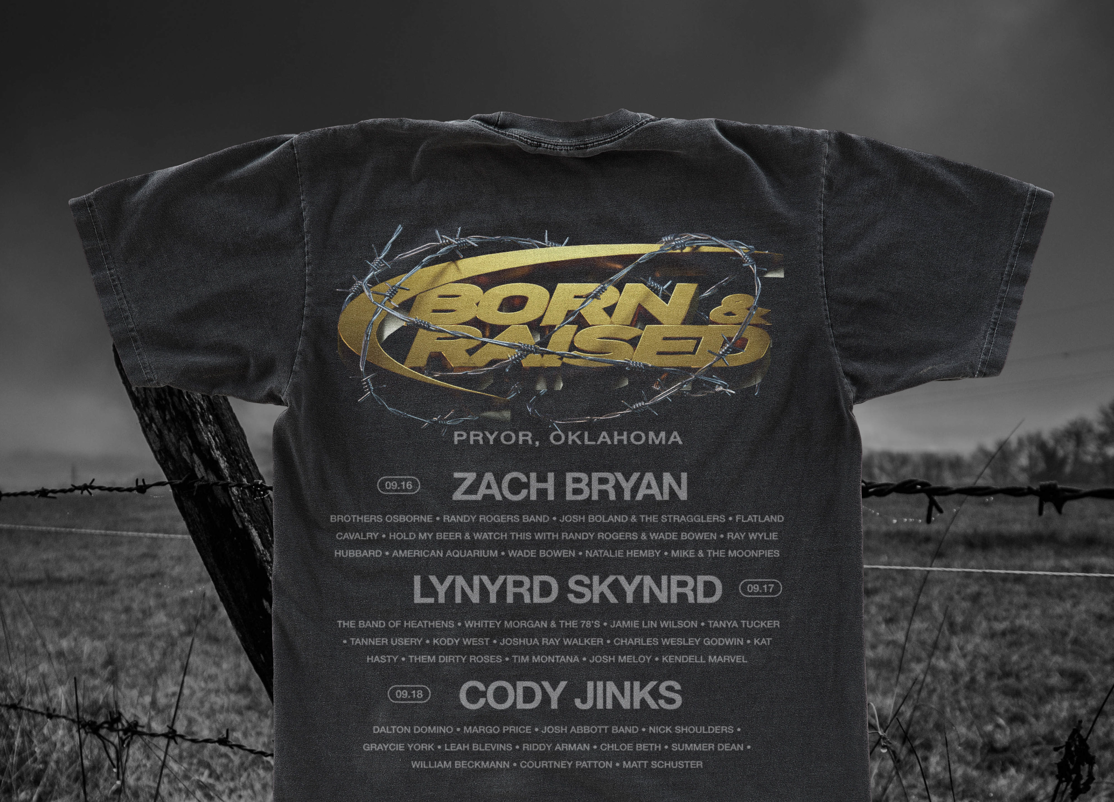
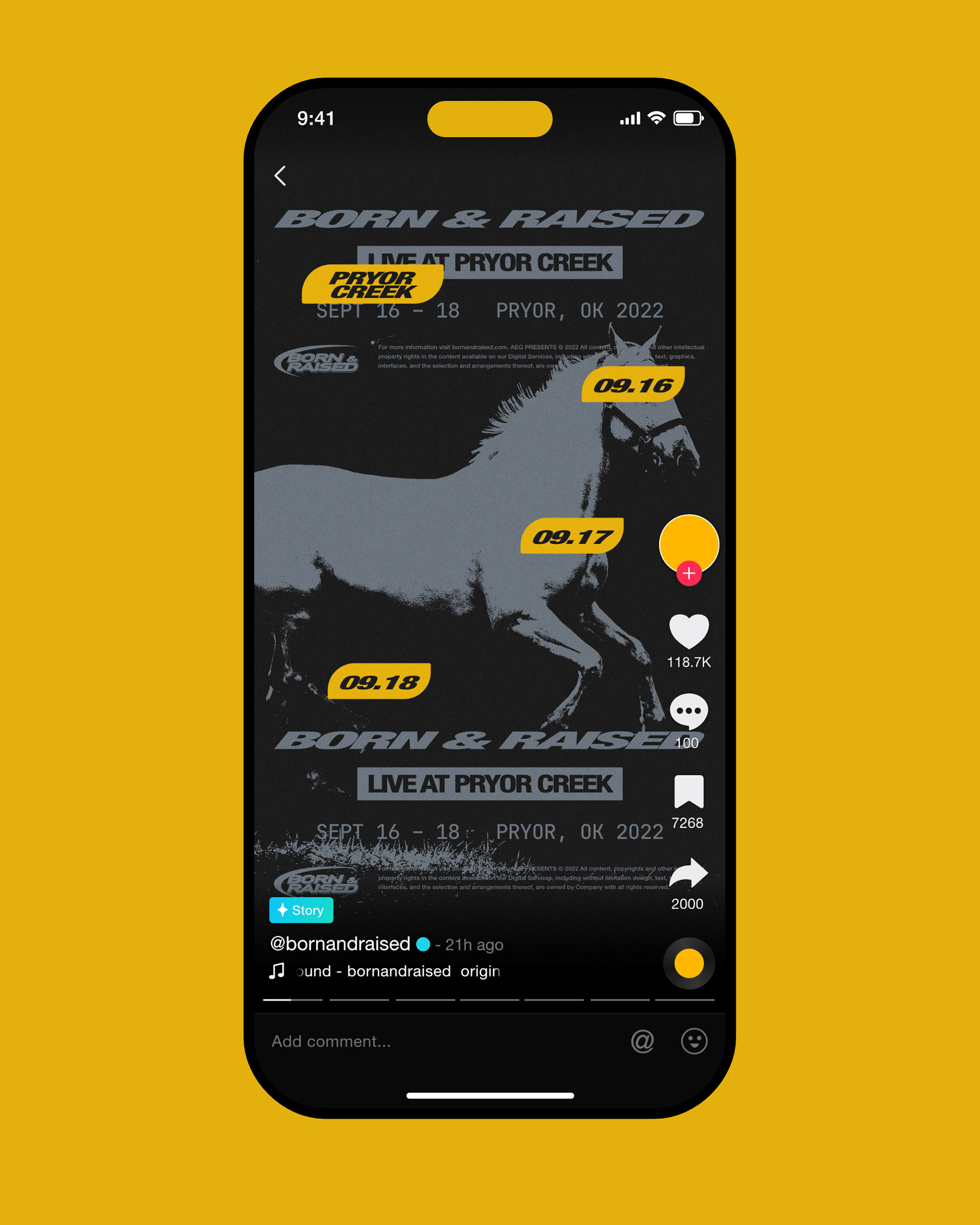
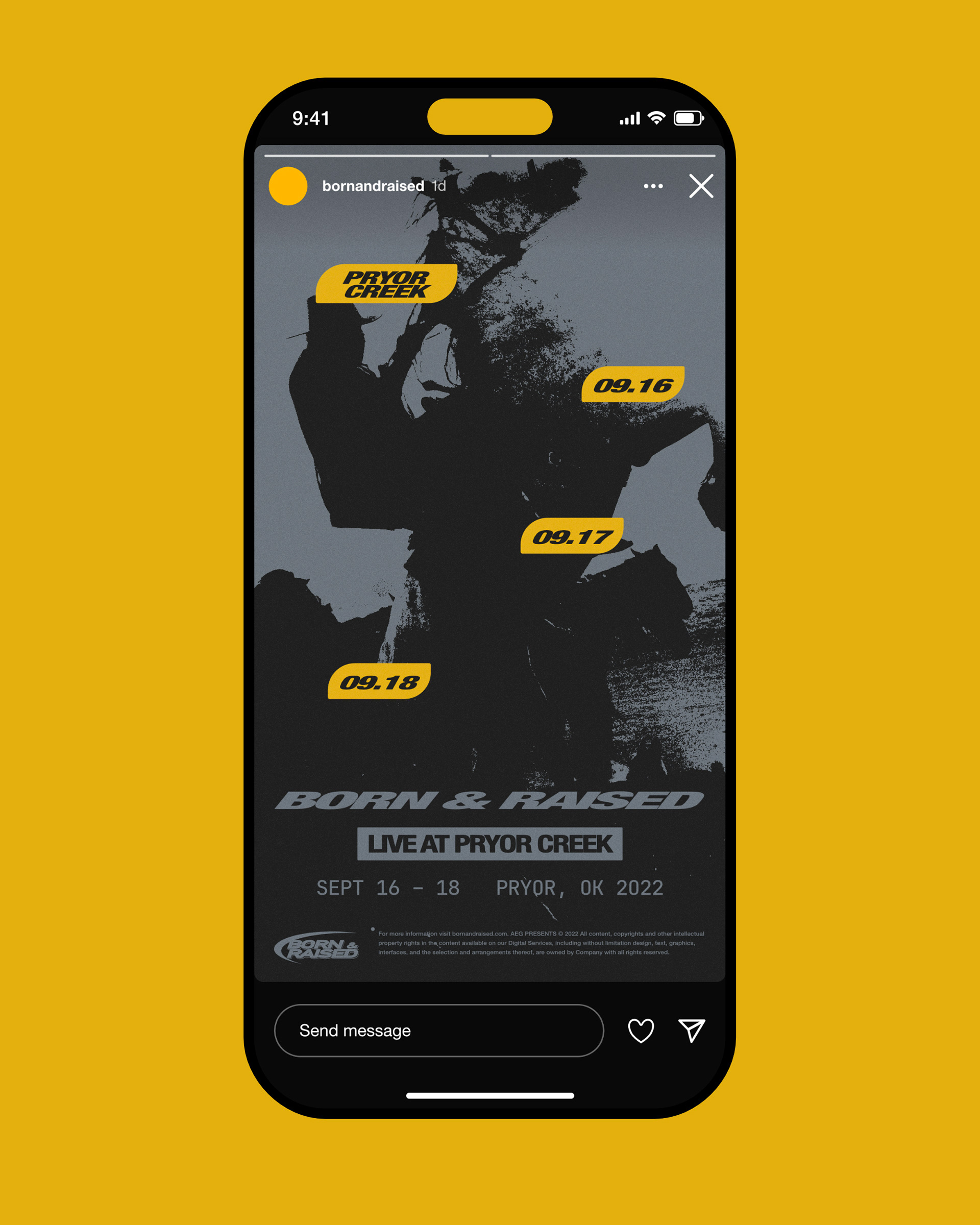
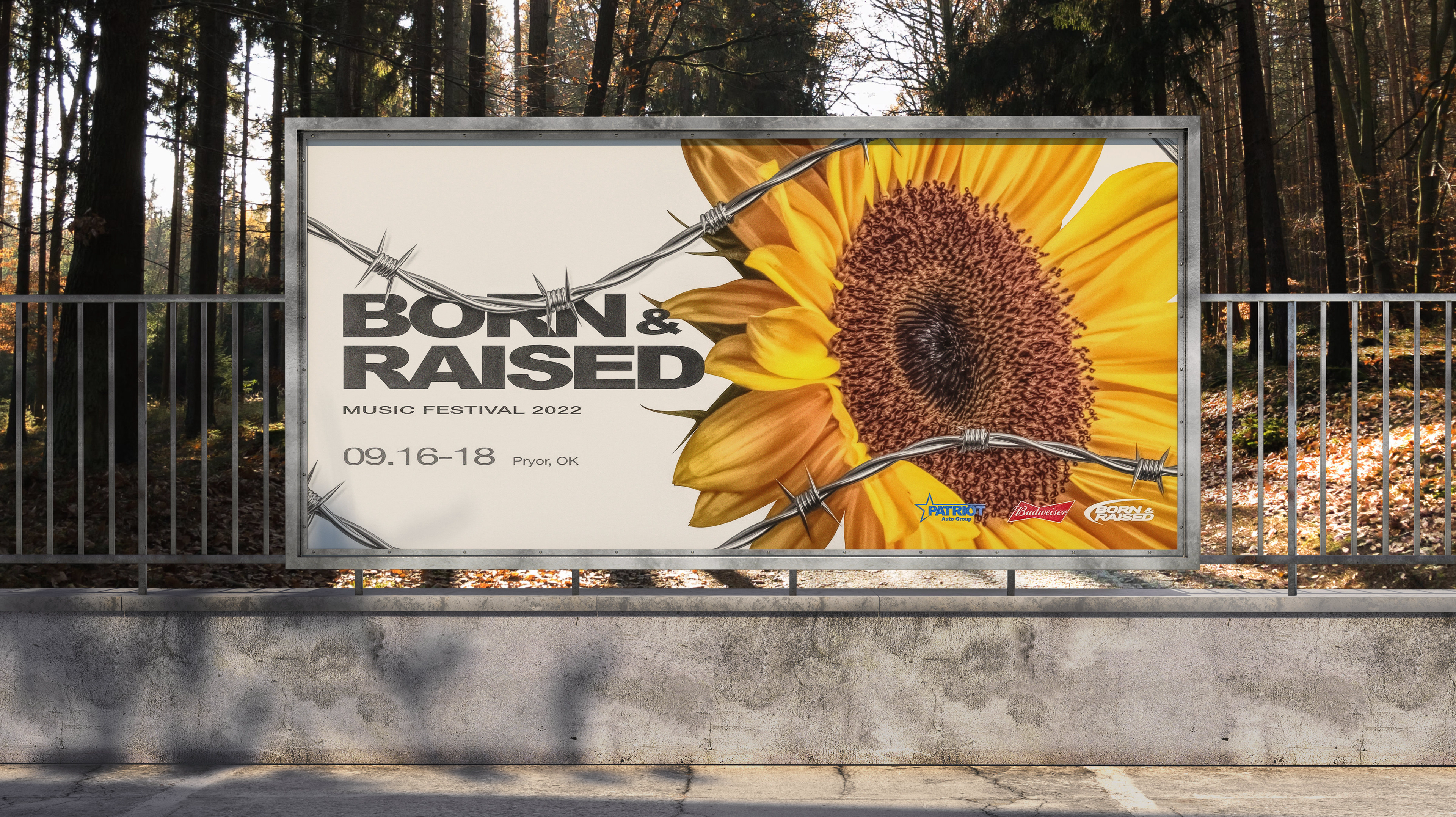
Born & Raised is a country music festival located in Oklahoma known for high energy country rock performances. Its existing branding leaned heavily on rustic western imagery that didn’t match the intensity of the live shows. This conceptual rebrand shifts the identity toward something louder, grittier, and more aligned with the atmosphere of the stage. Deliverables included a poster, billboard, T-shirt, and social media graphics.
Design
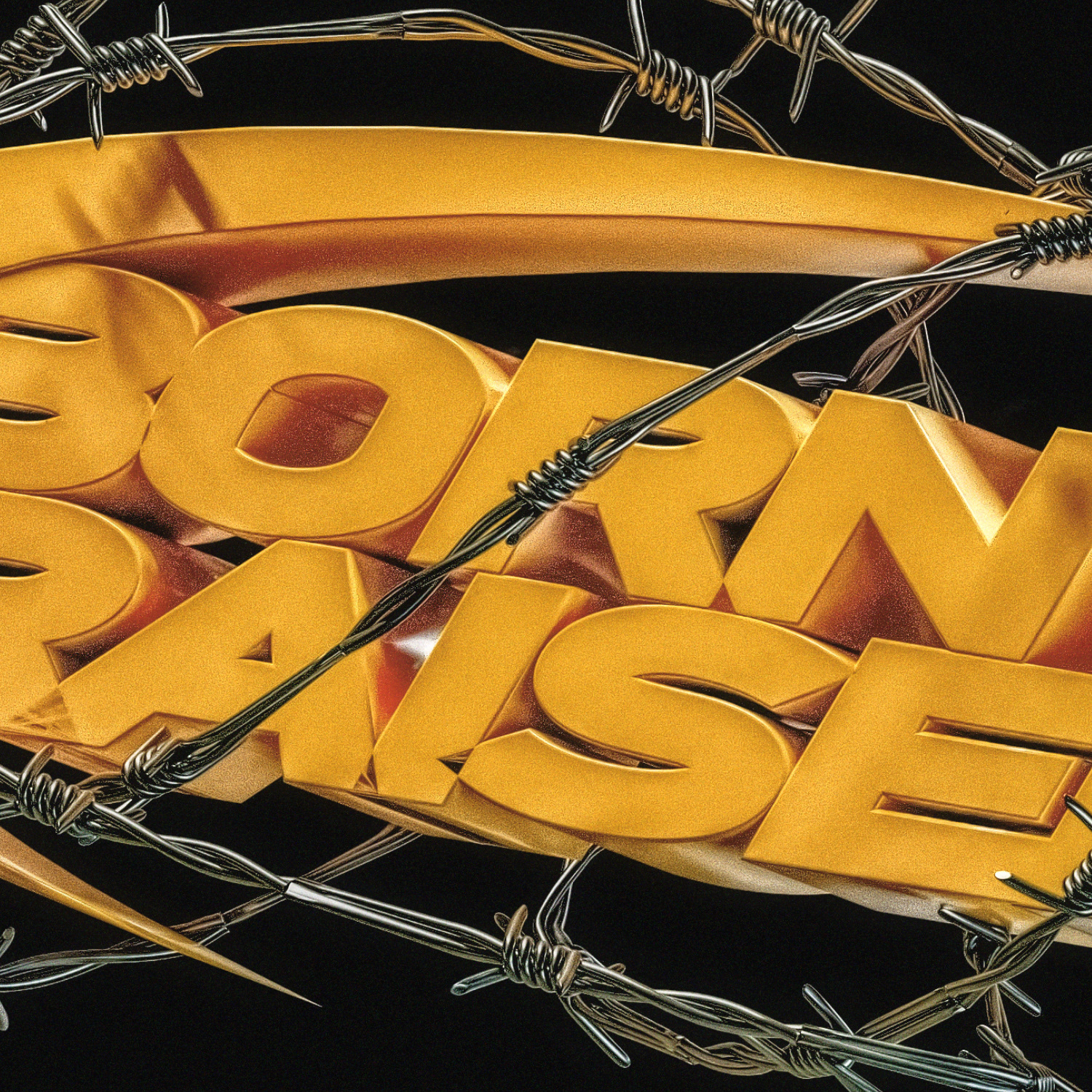
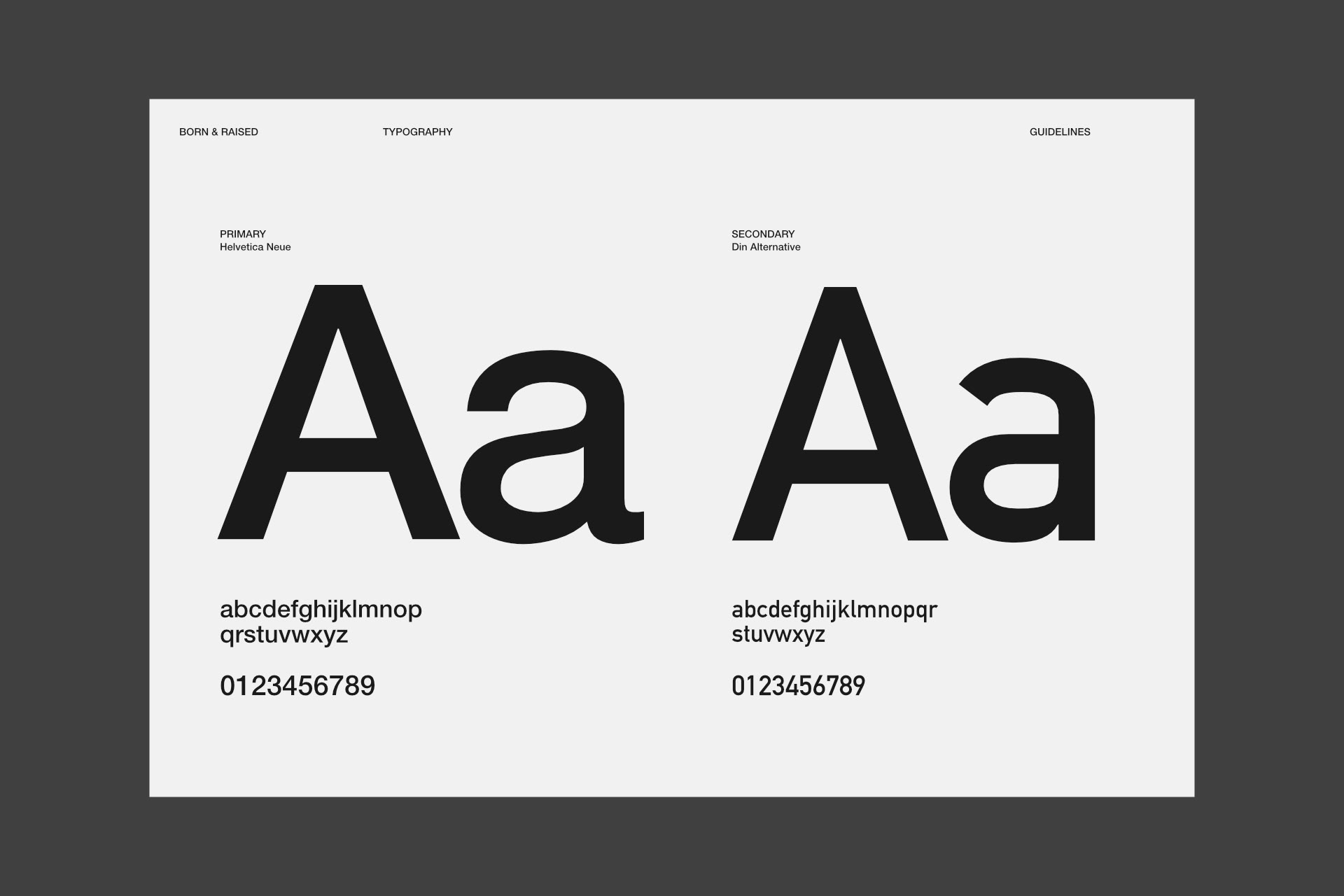
The identity avoids predictable western tropes and instead leans into bold color, heavy condensed typography, and barbed wire textures. Yellow anchors the system, while distressed layers and oversized type create tension and movement. Rural elements remain, but they support energy rather than nostalgia.
Process
The logo was built in Affinity Designer, then brought into Blender to create a 3D extruded version with wrapped barbed wire for merchandise visuals. Posters and billboards were constructed in Affinity Publisher and Photo, where typography, texture layers, and scale were refined for large format impact. Social graphics were reformatted vertically while maintaining hierarchy and brand intensity across sizes.
Outcome
The final system transforms Born & Raised into a visually aggressive, high-energy festival brand. It demonstrates strategic repositioning and the ability to build a cohesive identity across multiple touchpoints.